
Hi friends, I hope you had a nice weekend!
Disclosure: This post may contain affiliate links. As an Amazon Associate, I earn from qualifying purchases at no additional cost to you. See full Disclosure Statement HERE.
Moving into our home 3 years ago with a 1 year old & a 5 year old was a little hectic.
I had so much to do but I was so sleep deprived & didn’t want to make hasty decisions.
So I took my time.
Maybe a little too much but….
With the New Year came this sense of urgencies to finish unfinished projects.
And I have lots of them:).
{Can anyone relate????}
My mind is feeling like a channel changer lately.
I feel invigorated and crossing things off my list but I may need to slow down soon, lol.
One of my UP{unfinished projects}is my master bedroom,
which my husband is ALL to happy to hear.
So it began, the quest to find the perfect shades of gray paint.
Gray is so hot right now,
they say it is the new brown, which is a nice change.
I thought I would share some of my Benjamin Moore favorites…..

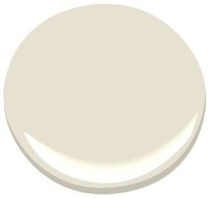
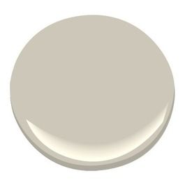
BM Edgecomb Gray

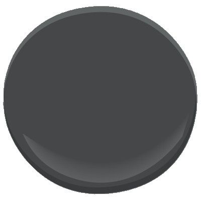
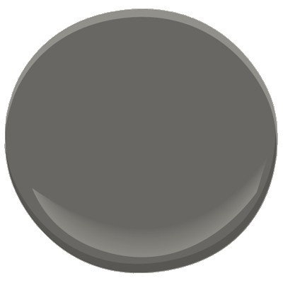
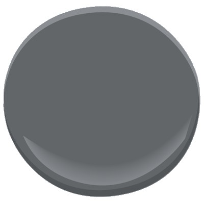
 BM Antique Pewter

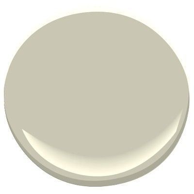


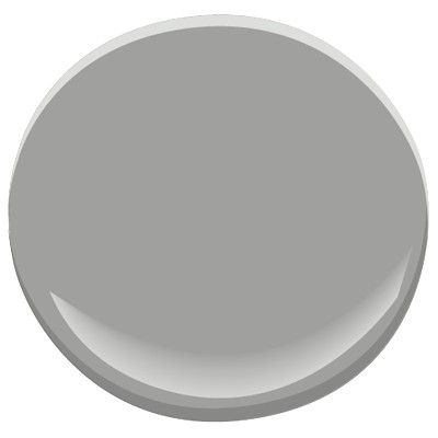
 BM Moonshine


Sharing at


I used Kendall Charcoal on these pieces of boy’s furniture and I love the colour! http://nicerthannew.com/2013/10/orange/ It is such a nice true shade of grey with no beige coming through. Greys are hard to pick!
Those are all great greys. The last two are my favorites. Good luck on choosing one for your master. And I know I already told your, but I’m in love with your signs.
Emily
Gorgeous grays! All the rooms in our home are painted some variation of a pale gray. 🙂
Angela @ Number Fifty-Three
Could you share the names of your pale grays?
We just recently painted the main rooms of our downstairs Edgecomb Gray and we love it. Best wishes on your decision, I know it’s not easy!
So many of my rooms have transitioned to Gray.I never realized how difficult and how many there were to choose from. Good luck with your bedroom.
I thank you so much for these selections. Gray is a color I use a lot in painting furniture. I get a lot of request for a special “light gray”, or “charcoal gray” or “just a good all around gray” etc. These are a good reference for customers to view. Thanks again.
I love Revere Pewter. I have it in my master bath on the walls and cabinets. I used to have it in one of the guest rooms. Such a pretty greige.
I have four of these greys in my home. Antique Pewter is absolutely stunning with Revere Pewter. I have an open plan and the AP is in my living room and the RP is in my kitchen/dining nook/front hall/foyer. The antique pewter is a softer, truer grey. Revere pewter can look greige in the some light – silver in others. Graphite is very intense and rich. There is a blue undertone so it can almost appear very dark navy in lamp light. Storm has a slight purple undertone compared to the others you will have to watch what colors you use in the room. Of all the greys I have, AP is the most true grey and looks incredible with just about any color I have introduced in the room. It is especially pretty with Mercury glass and sea glass. Good luck on making your decision!
Thanks Jen, I’m loving London Fog right now. Also the photo source for your Moonshine picture is Young House Love (not Pure Style Home) from here: http://www.younghouselove.com/2011/03/the-hallway-full-monty/ (scroll down to the 3rd photo) I remembered seeing their finished hallway there and if it were my pic I’d want the credit. A good case for watermarks 🙂
Loving all of the grays! I too am working on our master bedroom…I am stuck on bedding. LOVE your ETSY shop! Your art is beautiful! Life to the full! Melissa
LOVE those grays. Actually thinking of doing Luke’s office in Revere Pewter 🙂 Love your new signs. So pretty!
Gorgeous colors and rooms
That Kendall charcoal is really fascinating me, I think I am going to have to get a sample. I love your etsy signs too:)
Thank you Judy! The color is so pretty, the perfect shade of dark gray, good luck!
Jen
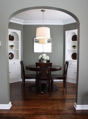
On the Houzz photo of the dining room with the Graystone walls, it’s tagged as a Kelly Moore paint, not BM..just wanted to verify which it is.
Beautiful grays!! I’m sure whatever you choose will be wonderful! I love your new signs…simple elegance.
Nancy
We are in the process of picking a color for our living room and dining room and I am leaning toward Gray Mirage (it was my post for today). I love so many of the colors you highlighted. You can’t go wrong. I would love for you to link this up to my Winter Blues Wednesday party going on right now. Hope to see you there. http://diybydesign.blogspot.com
Last week I decided to go with Revere Pewter for our foyer and my husbands adjacent office. I love it!
Did you notice a green hue to it? A friend just painted her large open floor plan, and it is very light. I wonder if there are two different Revere Pewters. Some pics on Pinterest look darker gray. I understand the lighting plays a part too. What are your thoughts? Thanks!
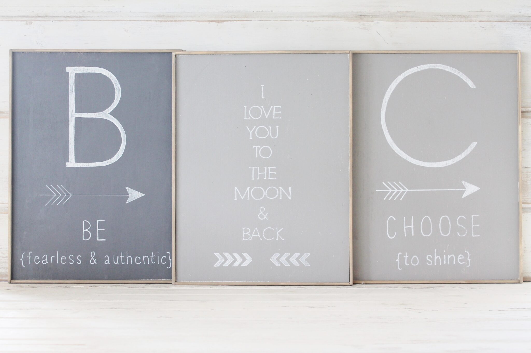
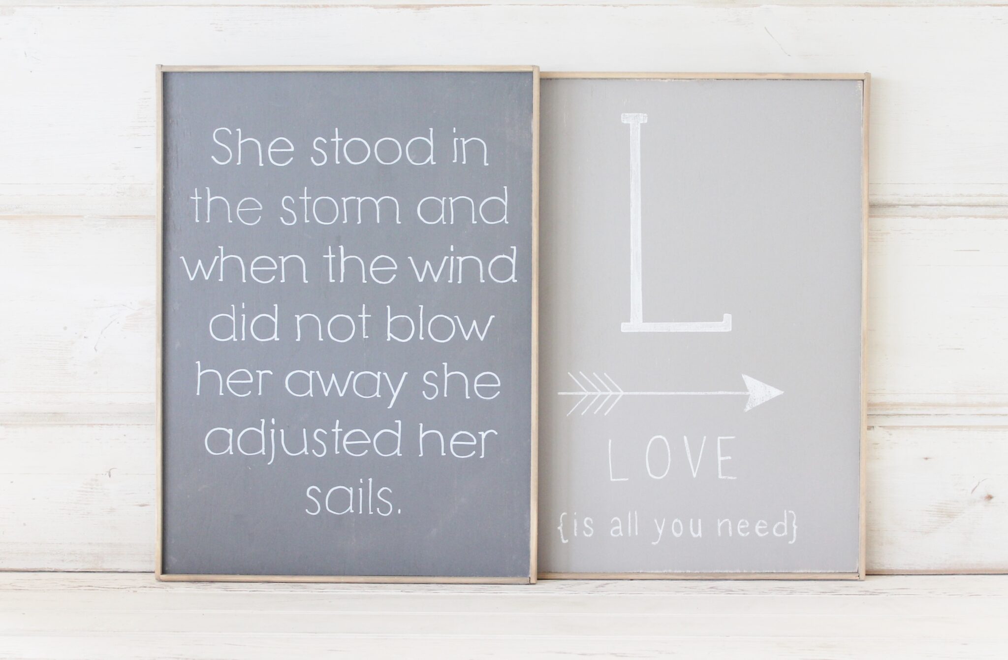
the quote on one of your signs should read
“She stood in the storm, and when the wind did not blow her way (not away), she adjusted her sails” Elizabeth Edwards
Thank you Patricia, I realized that, there are 2 versions around & liked this one:). Have a wonderful day!
Visiting from Savvy Southern Style-
Great grays-I have various gray hues throughout our home and I adore them!
Jemma
Thank you so much Jemma! I am glad you came by! Please visit again:).
Such an inspiring color palette! I’m looking at greasy for my living room right now and I’m leaning towards Revere Pewter and Graphite:) Thanks for sharing!!
Love those Sarah! Come back & share when your done! Would love to see, Jen
Hi! Right now I’m leaning towards BM Balboa Mist or BM Edgecomb Gray. Revere Pewter is looking just a little too beige to me. Gotta do poster boards in the next week or so though. Things might change. LOL
That is a great idea Gwen, I do that too:). Good luck! Let me know how it turns out, Jen
Balboa Mist is lovely. Thay is where we are leaning for our modern farmhouse. We already have half the kitchen painted and think it is the one. Next for the challenge, there is a bathroom The middle of the pain floor with one wall facing the front door and the other the big farm kitchen. If we stick with the balboa missed for the entire downstairs, does anyone have a suggestion for a stunning accent color for the accent wall. We want another gray, it must go with the balboa missed, and it must look good from all four sides, so one side is sunny one side faces north, and east and west of course. I can’t think of any other way than painting large swaths. That is scary though because the texture is thicker than I like already. Anyone have any suggestions?
Great colors!! Love BN paints. I found your blog while on Pinterest and now I am going to follow along. I would love for you to check out cloches and Lavender and follow back!!!
Cynthia
Greystone is a Kelly Moore color, not BM. It’s a one of their pre-mixed (exterior) colors. I recently used it, and it is a great neutral color. Your sample picture source also correctly identifies it as Kelly Moore. By the way, I love BM’s Carrington Beige, I have used it in the living and dining rooms of six separate properties. It has an elegant look that is neutral enough to not clash with almost any furnishing colors.
Sorry, the correct spelling is Graystone
:)So here I am looking for paint colours and dreading the choices when I happen upon your site!. Revere Pewter Pic has the same sofa as mine!!!! Thank you!
We have about half of our house painted Revere Pewter & love it. The pic of it looks sort of bluish but it is not blue! 🙂 I also love Galveston Grey. My white cabinet kitchen is painted this color & I ADORE it!!! We like Chelsea Gray too but it was a little darker than I wanted to Galveston grey won out! 🙂
I painted my dining room, foyer and upstairs hallway Revere Pewter. It looks a little bit blue on the first floor (similar to the photo) and it looks gregge on the second floor hallway which is more enclosed. It is the best selling gray at my paint store. We painted upstairs rooms adjacent to the Revere Pewter hallway Edgecomb Gray and Pale Oak. Edgecomb Gray worked well with my bathroom beige fixtures and tile. Pale Oak for the upstairs office because is a very light and creamy gray. Now we have to pick a gray for the master bedroom which gets less sunlight. The bedspread is light gray with slight blue undertones, beige carpeting and a dark wood dresser and bed. Any suggestions? I think Revere Pewter would be too dark since the room gets little sunlight.
Definitely Stonington Gray. It is calming and has beautiful subtle blue undertones. I did my sons bedroom and it sounds like the room you wish to paint. It turned out great.
do you think BM – Stormy Sky would be a good exterior color on a stucco house! Black shutters and White trim! HElp!!! love you blog and ideas!! help please!
Thinking about gray mirage In my 2 room bathroom with high ceilings. What other color would go nice as accent?
No one mentioned anything about trim color for gray paint colors…..
Decorator white looks great in my house. It is a little stark with gray undertones do it looks very crisp. Some people prefer Dove White. Both are Benjamin Moore colors.
Is there a universal color for the ceiling that works well with white woodwork and molding?
I have painted my master bedroom Kendal Charcoal with white trim and white ceiling. It looks too cold for me. Any ideas what color to paint the trim and ceiling, so the room feels warm??? HELP!!!
What is your favorite ray for kitchen cabinets?
Hi I was wondering if I could get your opinion. I’m redoing our master bedroom. I now have a navy/dark blue upholstered headboard and mirrored night stands. The other furniture (chest and dresser) are mahogany. I have a large window facing the north… I’m between BM Gray Owl, Stonington Gray, Collingwood, and Balboa Mist. Any suggestions to help me face this daunting decision? I fear getting a tint of color that will clash with the blue headboard or do I even need to worry about that?
Very nice! My BM favs are abalone and barren plain!
Awesome colors, thanks Kim! Stay warm:)!
Can I send pics of my kitchen for paint suggestions?
Imswore I would not use revere pewter in my bedroom because it was so popular, but after testing 10 different grays in the space it was the one that I fell in love with. Just remember put a sample of each gray on every wall and look at it at different times of day. Some look blue others purple and others even green. Good luck
It’s an amazing color Rebecca!! Oh yes, they do all look different:). Have a good day, Jen
Sorry Mark Sutter but it is a Ben Moore color. Check out http://www.benjaminmoore.com/en-us/paint-color/graystone
My dining room is painted the bluish gray owl by BM. I am trying to match a deeper color that would coordinate with this for my small entrance hall. I like the Stormy Sky and Storm. Would either of these work with the Gray Owl. Thank you