
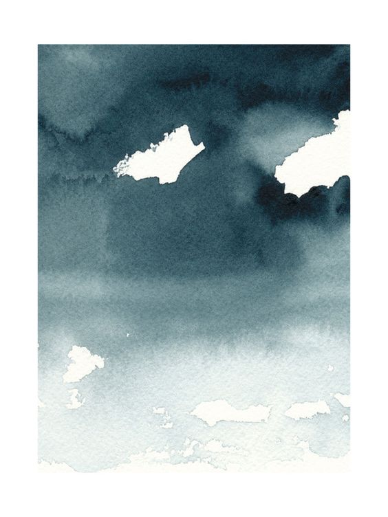
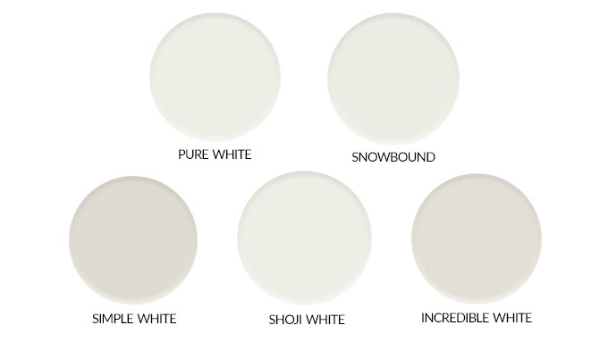
It seems the decisions for the den are never-ending lately. I am not complaining at all because I love all of this but do you ever feel stuck? Like you have been making so many BIG decisions that your brain gets kind of fried? Well, that is how I am feeling right now. I have a bit of a paint dilemma, to go light or dark for the den walls. Right off I knew I wanted the space to feel either bright & crisp or deep & dark, I narrowed it down and selected 5 of each. Last week I picked one of the dark colors for the walls and said to myself, “this is it!!!” I was that sure:). Then I finished an abstract art piece for over the sideboard and stared at it all weekend. I realized the bold art piece would stand out way more with white walls. So I am still on the fence. I actually still love the stormy blue but it’s time for a change. At the end of the day I have to pick a paint color that is going to feel right in our home regardless of trends or a deep yearning to try a bold color.
Disclosure: This post may contain affiliate links. As an Amazon Associate, I earn from qualifying purchases at no additional cost to you. See full Disclosure Statement HERE.
I am thrilled to tell you that I will be working with Sherwin-Williams this entire year!! I will be on their Blogger Panel along with 3 other amazing bloggers. I will be sharing some fantastic paint posts and will also be part of 2 wonderful events where I am giving back to the community. One of my goals for this year was to give back. After much soul-searching last year it felt like a natural step to share my love of home design with others in my community. So this really is a perfect match.
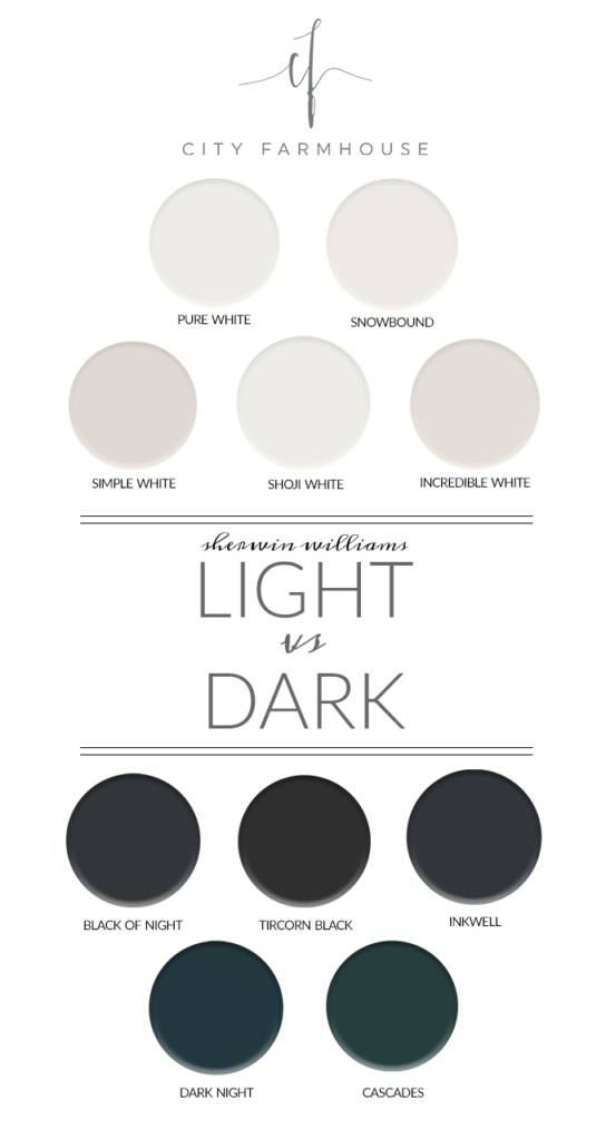
Ok…so here are the Sherwin-Williams paint colors I have narrowed it down to for the den….
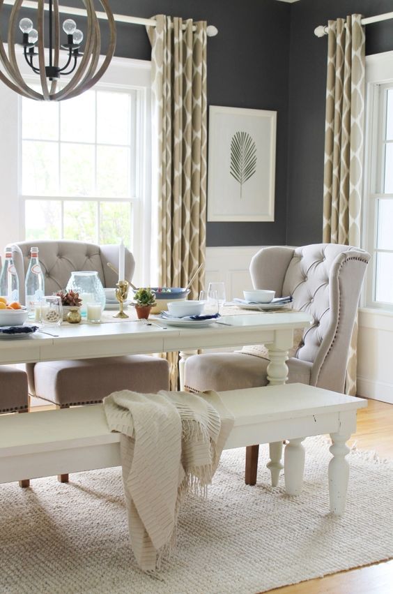
Keep in mind this is my dining room that is now the den.
And this is the hue that I am in awe of lately and some art that caught my eye…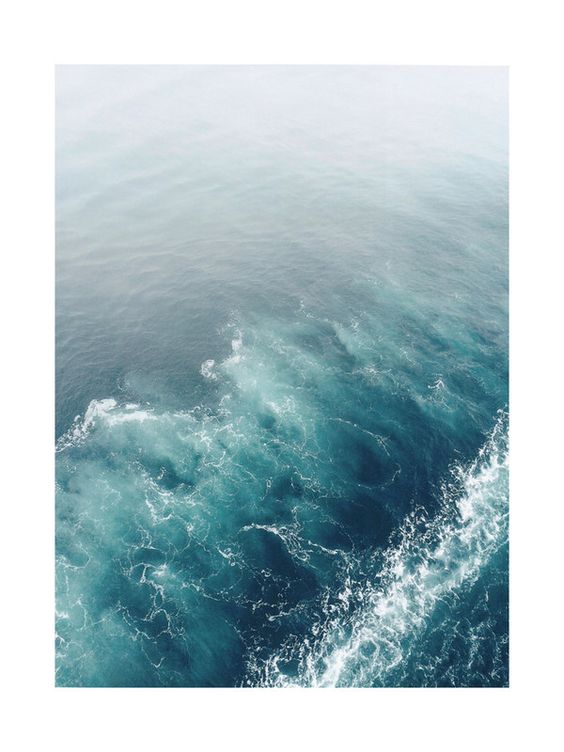
Remember this is the design plan….
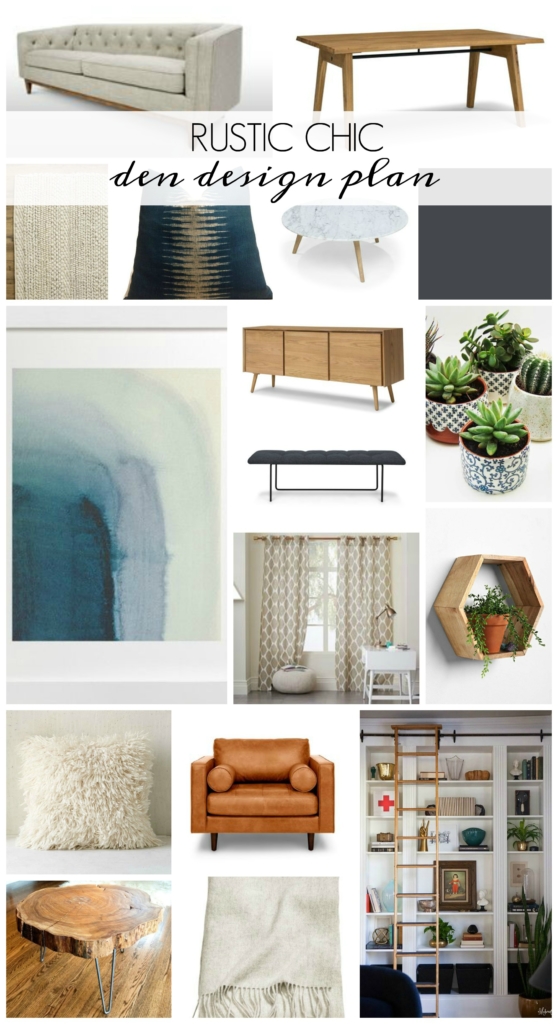
One more time…
The white contenders…
And the dark contenders….
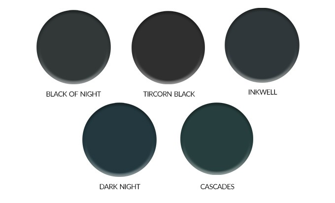
Any thoughts? Have you used any of these colors?
The plan from here, finish art piece #2 and see what I think about the contrast, then paint samples right on the wall. Wish me luck!!!
Have a beautiful day, friends!


Is that the painting ? Can you mat it with white ? Otherwise I think light walls (although in these winter months dark would be so cozy)
I actually painted something myself but that was the inspiration color. I am adding some other art and photographs, so I do agree with you, light would work best. Have a happy Monday! Jen
We are changing up our living in the spring, too. We are going from a beautiful blue, to a cool-grey toned white, similar to Simply White. So I am leaning to have you also go that way to see what the space looks like!
Thank you Amie! Good luck to you as well!! Jen
I have used Incredible white.Soothing and goes with evrything.
Thank you Cynthia!
What direction does this room face? How many windows? How much light? Big decision.
Dark paint can be depressing.
We have a ton of light in here with the bottom half white picture molding so it ends up the dark paint makes a nice statement but…decisions, decisions, lol. Thank you! Jen
Anxious to see what you decide. I know it will look great no matter what. Love the coffee table in the picture. I like white but really love the dark colors on the wall.
Thank you Donna!
I think that Simple White is stunning, i’ve been looking for a white and I think I found it!!
Oh good Lauranna! It is so pretty and soft with little undertones. Good Luck! Jen
I used Snowbound throughout my interior walls and then changed chocolate brown exterior shutters to Snowbound. I love it.
Snowbound is beautiful!! It’s a favorite for sure. Thank you so much, Jen
I just lost my mind choosing a shade of white so I feel your pain. Sometimes it’s just good to sit on it a while, then just choose. I think you can’t go wrong with any of.your choices. It’s only paint! LOL.
Agreed, thank you Jody:). Have a great Monday! Jen
I think one of the whites would be pretty. When I envision a den, I think of a
place to retreat to, a peaceful place to curl up with a good book and a loving pet,
a place to sit and ponder. For me the beach and the ocean is God’s den, always
offering a place to ponder life. When I think of the beach, I think of the neutral
sand, the light of the sky. Your home reminds me of the beach, which is one of the
reasons I admire your style. I love the artwork, especially the first piece. If you notice
those amazing shades of blue- green are etched by the white foam. If it was my choice
I would select one of those dreamy whites, and I would bring in accent colors through
accessories and artwork. Whatever you choose, I am sure it will be lovely. Good luck,
can’t wait to see your reveal.
Thank you Suzie, I am on the exact same page with you! Your thoughtful comment was a great help, Jen
Really excited to see what you decide. This is the exact design plan that’s in our living room, we currently have white walls but would love to change that at some point. White works great but I am intrigued but some of these dark colors as well. Good luck deciding!
Thank you Kelly! I will keep you posted! Jen
Go take a look at Halcyon Green at SW. Paint two coats on some foam boards before you make your choice. It’s serene.
Thank you Karen, I will:). Jen
Oh, I’m on the same dilemma as you. I can never choose the pain color, I always get stuck in at least three colors. Keep us updated, please! xx