
Disclosure: This post may contain affiliate links. As an Amazon Associate, I earn from qualifying purchases at no additional cost to you. See full Disclosure Statement HERE.
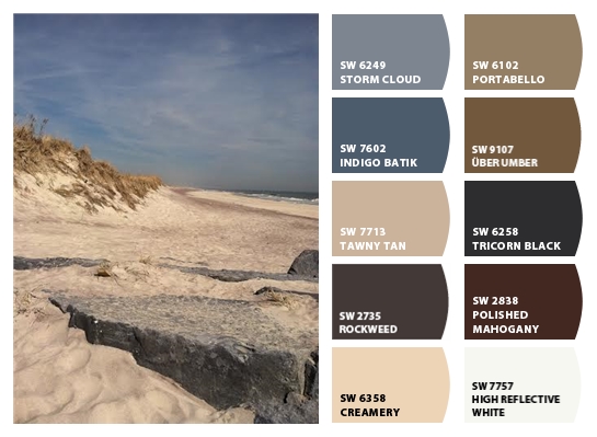
Hi there friends! Last October I had the privilege of attending a Color Trend Luncheon in NYC hosted by Jillian Harris and HGTV Home by Sherwin-Williams. It was an incredible experience to say the least. The intimate afternoon conversation was centered around color trends in 2016 and was led by Sue, the Color Marketing and Design Manager at Sherwin-Williams Diversified Brands Division. It was good food, good people and the most valuable insight into hot hues in the new year. I felt like I was writing notes the entire time, so obviously I walked away with lots to share. As I broke my list & thoughts down, I realized I should start with a color trend that was livable and one that most of us are impartial to. It’s the idea of using color elements from sea & sand to build a collected, natural and connected palette. Also known as Surf & Turf, that is the creative language that was used at the luncheon.
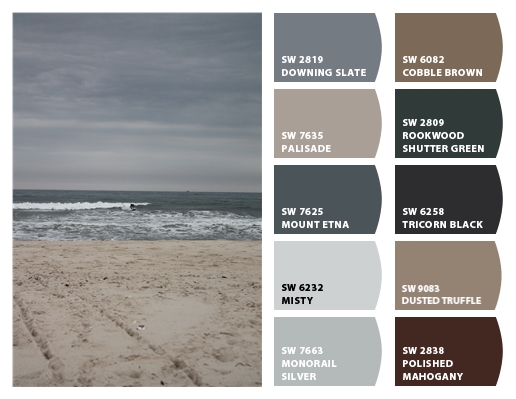
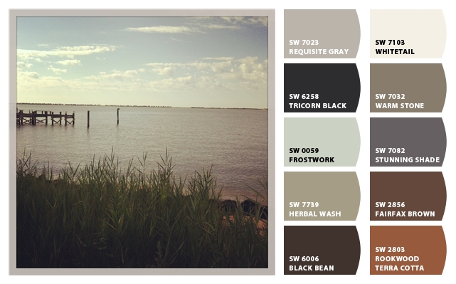
I love this color combination for so many reasons but mainly because it’s universal & relatable, whether you live coastally or not. Most of us have traveled to the coast at one time or another & the sea left us with a peaceful memory and if not, then maybe you dream of visiting the coast someday. Either way it is a pleasing palette, the tones are organic, bold, blue and moody, they draw you in, captivate you and take you away to another place.
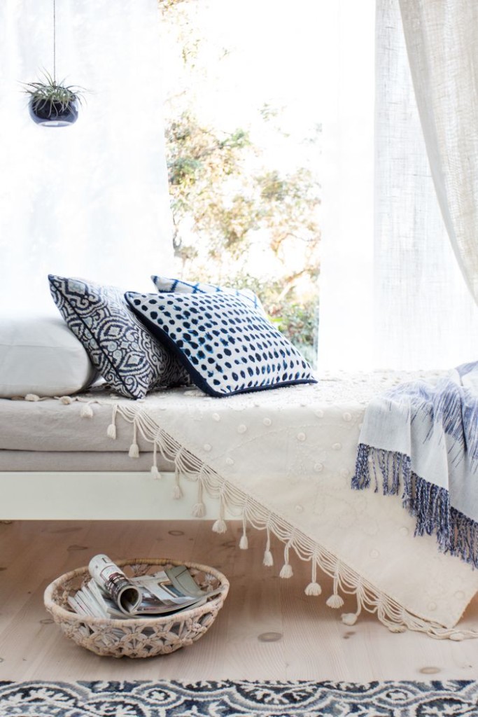
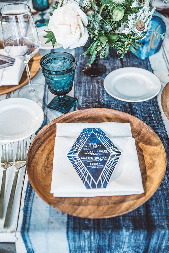
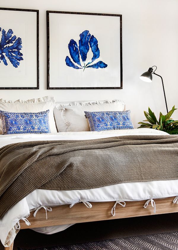
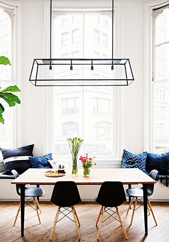
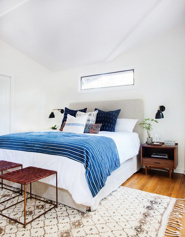
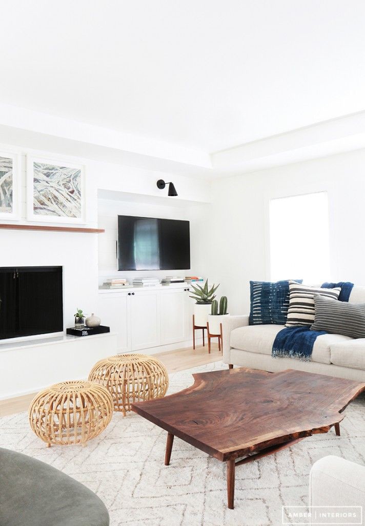
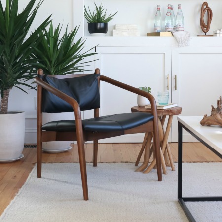
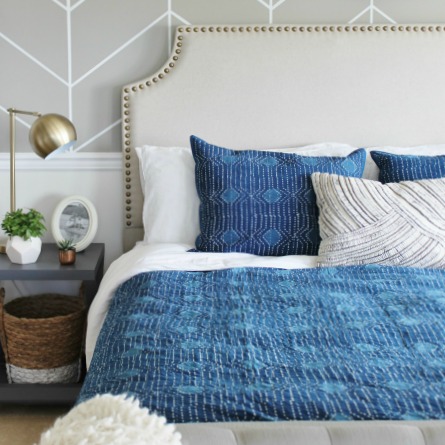
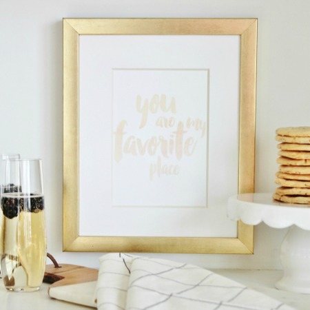
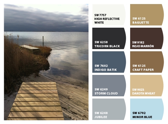 Indigo has become a hot color choice and when used with the natural tones of a sandy landscape, it becomes a beautiful pairing. Through layering crisp whites, woven materials, warm woods and shades of blue we are able to bring this palette to life.
[via]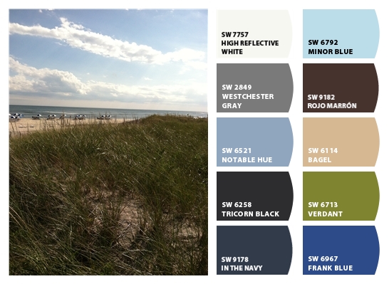
[via]
[via]
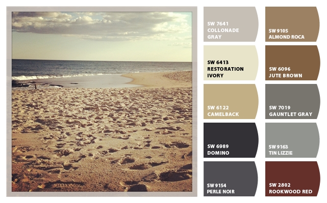
The warmer, earthier and beach tones can be reflected through organic materials such as baskets, rugs & other accessories. Lets not forget that leather & wood can bring in this warmth as well.
[via]
 [via]
[via]
[via]
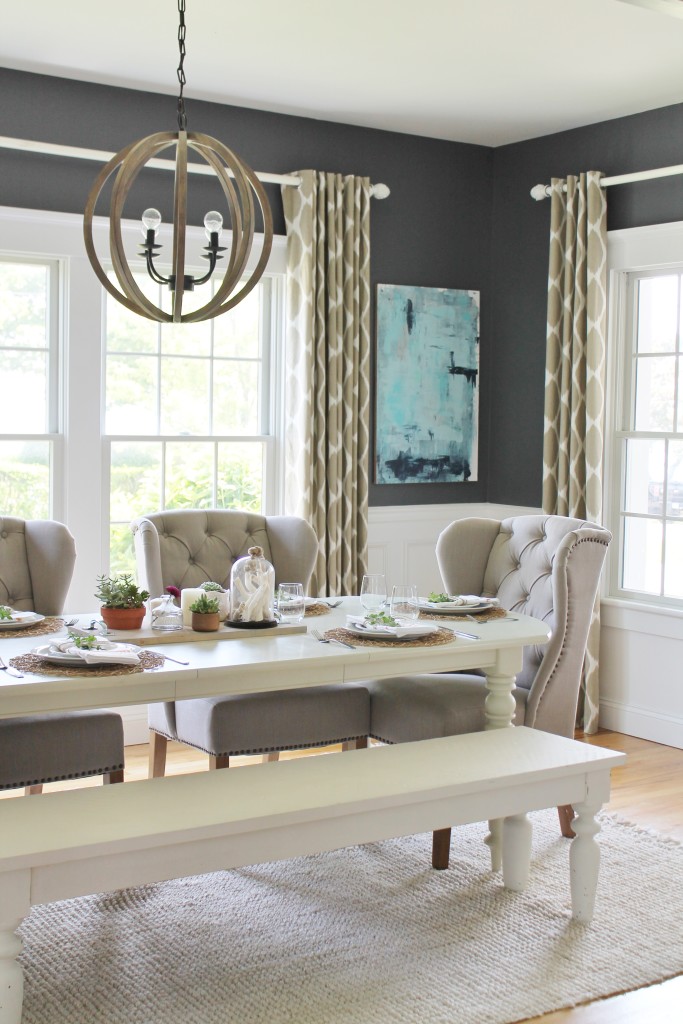
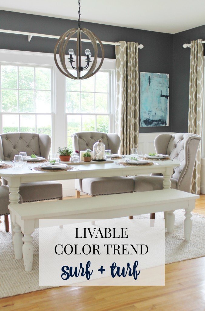
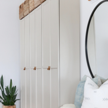
You can find my dining room reveal HERE.
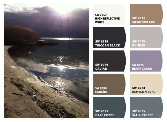
Here are some other palettes I had fun creating over at Color Snap. It is so fun & easy you will find yourself addicted to this feature.
What do you think? Do you love this color palette as much as I do?
Thank you for stopping by! Have a beautiful day!
Beautiful inspiration, Jen. I love deep, dark blue with almost any color. It’s hands down my favorite shade to add to any room…and I think soon every room in my house will have it!
I know me too! I cant wait to see it in every room, your house & taste is amazing!! Jen
Yes! I love mixing the blues with the neutrals. My office and master bedroom have many of those colors and as I plan my dining room makeover, those are the colors I have been most attracted to! Great post!
Shelley
Thank you so much Shelley!
Beautiful palettes! I love the mix of blues, grays and browns. Doesn’t nature create the best color ideas?!
Thank you Brenna! It sure does! Have a good night, Jen
Loved the post! And those colors I really like to! My husband and I are in the middle of painting our house(top to bottom) And the color we chose for the walls is cream in my coffee by valspar. Such a pretty color!
Sounds so pretty Shawnna! Good luck! And thank you! Jen
This color combo just feels…right.the rooms feel relaxing.
Thank you Carole, it is a good one!!Have a great day! Jen