
Hi City Farmhouse friends! It’s Emily from The Wicker House here and today I wanted to stop by and share our home’s calming paint colors with you.
Disclosure: This post may contain affiliate links. As an Amazon Associate, I earn from qualifying purchases at no additional cost to you. See full Disclosure Statement HERE.
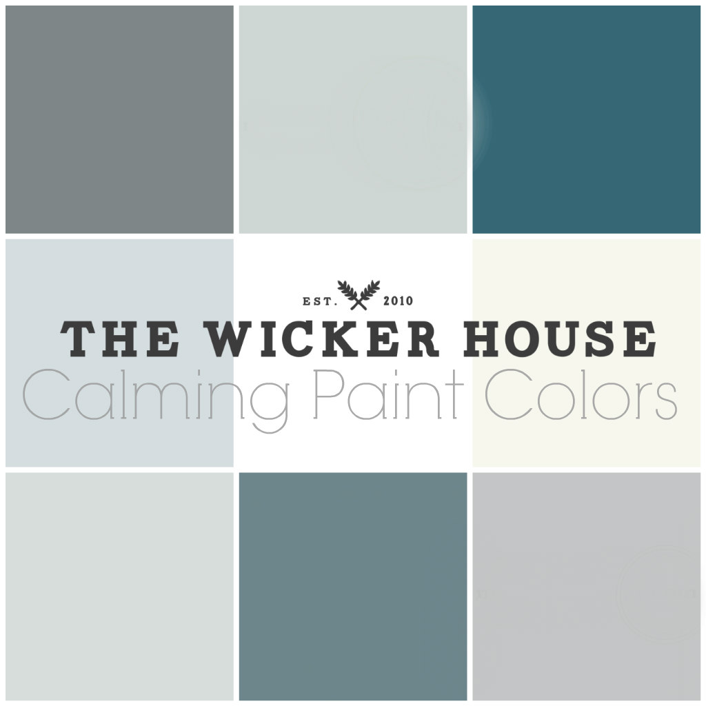
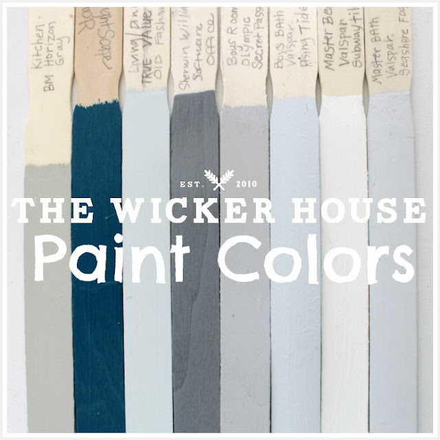
Believe it or not, I have a really tough time choosing paint colors for our home. There are so many different colors out there to pick from that it makes finding the perfect color for a space a bit overwhelming.
My process for choosing a new color for our walls goes a little something like this; first, I gather inspiration from my Pinterest boards and decide on a look that I want to achieve. Then I tape up a bunch of color chips and envision what each color may look like on the whole wall. I remove the ones that I know are just not right. Once I have narrowed my choices down to under five, I’ll head to Lowes to pick up some small sample paints and paint small sections on the wall. From here, I’ll have my husband, Jake make the final choice. Jake is a natural at choosing colors for our home and so far he hasn’t let me down.
By sharing our paint colors with you today, I’m hoping that I can help you by letting you see how these particular colors look in a room. You will probably notice that these colors all flow nicely together throughout our home, this is something that is important to keep in mind when choosing new colors for your own homes.
Lets start with our front door.

Going with this bright of a blue for our front door was a big move for me. As you can see from the above color palette, I usually stick with light and calming colors, but this pop of color was just what the exterior of our house needed, and I have never regretted painting it.

In fact, I liked this color so much that I painted the interior side of the door as well.
I like that this cheerful color is the first thing you see when entering our home and the last impression you get when leaving it. This by far has to be the most asked about color in our home.

When you walk into our home you are greeted into our open living and dining room. I kept the spaces undivided by painting it all in the same color.

This soft blue is light enough that it works great as a natural.
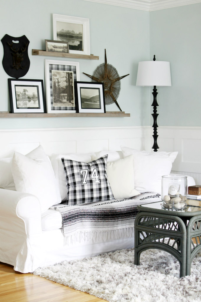
I also think this color looks really pretty with all of the white molding that wraps around the room.

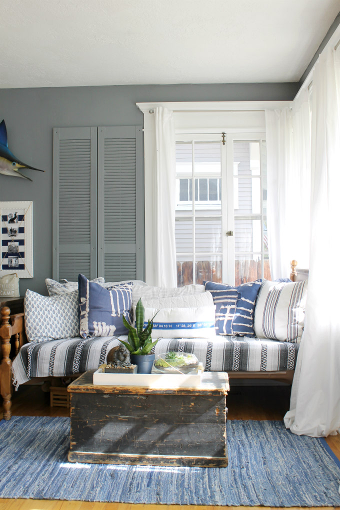
Off of the living room is our sunroom/home office. In here I have used a warm gray on the walls.

I actually repainted this room right before Christmas last year. I was looking to bring in a more cozy feeling to this space during the holidays. You can see HERE that I was able to achieved the look I was going for.
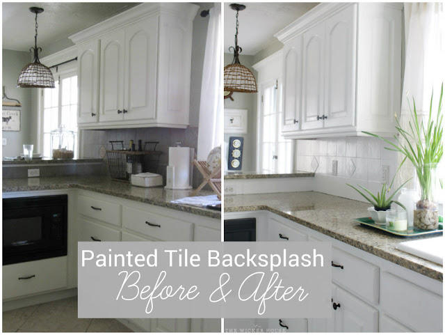
Our kitchen has probably been painted more times than any other room in our home. At the moment I have this teal color on the walls.

There is so much white in this room that really any color I paint in here is going to pop and look great.
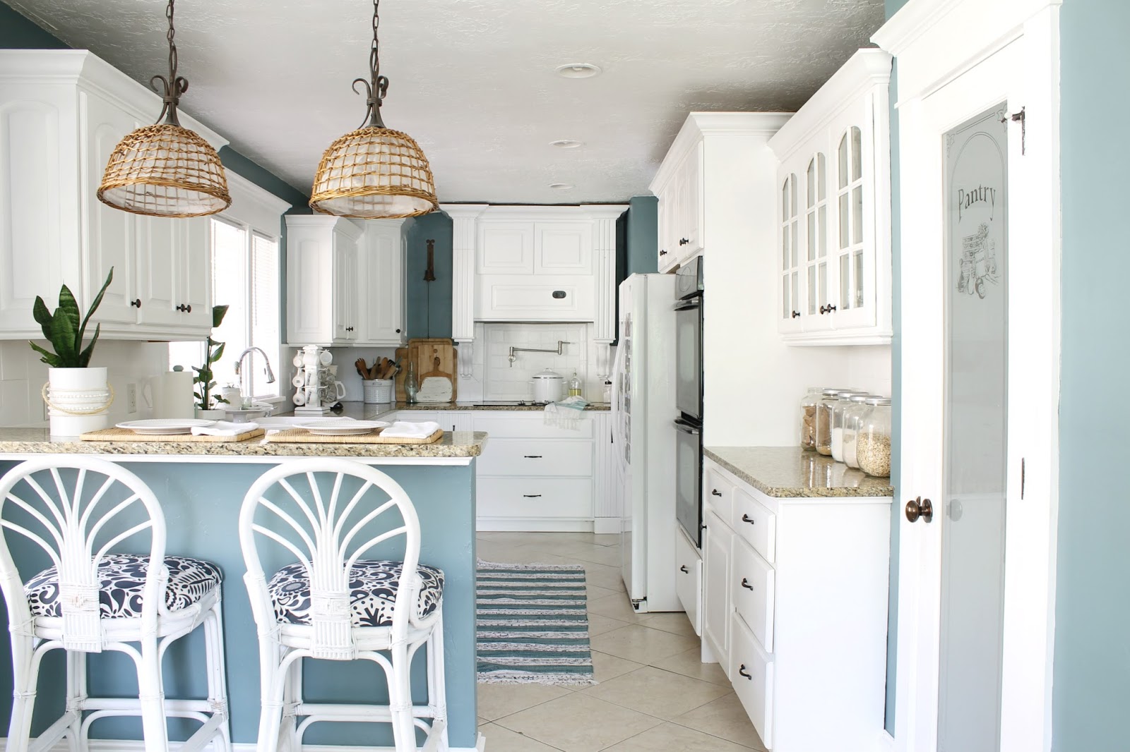
In our kitchen I have also painted the wood stove mount, the cabinets, as well as the title back splash. So ya, I certainly wasn’t lying when I said I’ve painted a lot in here. You can see what our kitchen looked like before in this post HERE.

In my boy’s shared bedroom I went with a medium gray color called, Secret Passage. Great name for a boy’s room, right? Sometimes it’s the paint names that are the deciding factor, am I right?

I recently gave my boy’s room an update by painting their beds and rearranging their room. You can read more about it in this post HERE.

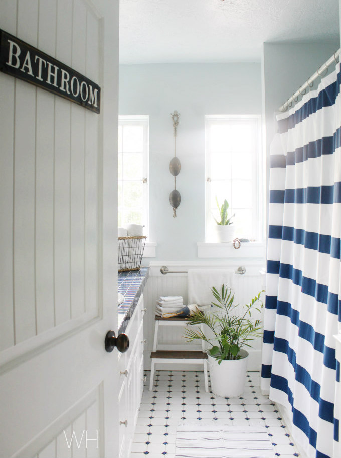
The main bathroom in our home has navy tiles on the counter tops and navy and white tiles on the floor, so it was a no-brainer to go with blue paint on the walls.
You can see more of our main bathroom, along with the DIY bathroom sign on the door in this post HERE.
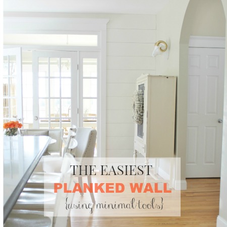
Heading upstairs is the master suite. I wanted to paint the walls up here white, but when it came time to paint, I went with a bit of an off-white instead. I wanted to give the room a soft feel, and I was concerned that a white might be a bit stark.
This color is really pretty, I’m actually thinking of using it again in other areas of our home.

Oh, and did you know those aren’t real planks on my walls? I’ve actually drawn them on with a pencil.
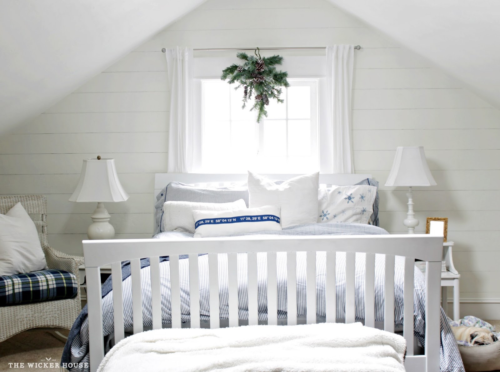
You can learn how HERE.

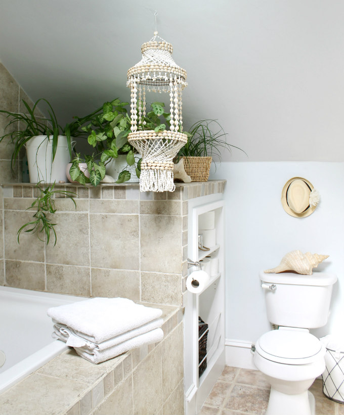
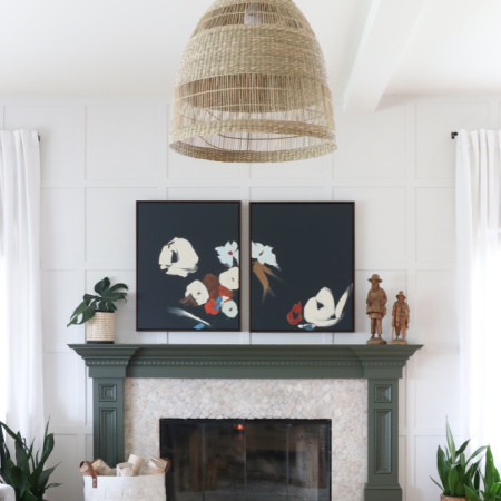
And the last room in our home that I wanted to share with you is the master bathroom. This color has a bit more blue in it then it looks in the sample.

With the angled ceiling taking up much of the wall space, I made the decision to use one continuous color on all of it. I also wanted to have a color that blended with the tile rather than compete with it, so this color was a winner for sure.
As for all of the white in our home; The trim, doors, kitchen cabinets, furniture, All of it, if you see white then this is the paint I used to paint it. Olympic One is my absolute favorite. I just grab it off of the shelf at Lowes. I’ll have it stirred, but never tinted. I’ve actually gotten in a few arguments with the Lowes associates claiming that I HAVE to tint it, but I have found that I like it just the color it is.
And that completes our home’s paint colors tour … well for now, I’m sure I’ll be back to choosing new colors to repaint these rooms in no time. I have a problem, I just enjoy freshly painted wall too much.
Be sure to check out some of these other paint post of mine, like this ONE where I share ALL of the colors I have ever used in our home, and how I keep track of them all.
How to create this DIY Sherwin Williams fan deck.


Thanks City Farmhouse for having me over today.
Please let me know what you think of our home’s paint colors, or if you have any questions about any of them. You can leave a comment below, or come chat with me on Facebook or Instagram
Emily
YES to all of these colors! Calm and comforting indeed.
I agree:). Happy Friday!
You nailed it! Everything here is so beautiful. Excellent job.