
15 Livable Home Trends in 2016
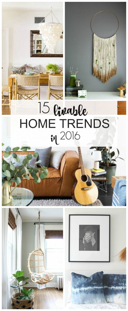
Hi there friends! Last week I shared a post on a “livable” color trend from the Color Trend Luncheon I attended in NYC hosted by Jillian Harris and HGTV Home by Sherwin-Williams. The color story was called Surf + Turf and it was by far my favorite but…there were many other amazing color and home design trends for 2016 that were the topic of conversation that afternoon, so I wanted to share those as well.
I love gaining insight into current home trends, some I love right away, some I need to think about and others I know I can re-invent in a way that won’t leave me at a loss when they become extinct once again. My feeling on trends is…if you love it and did so from the very beginning, then go for it! When I say go for it, I mean you use them in a more permanent way, like tile, drapes, furniture, lighting and wallpaper, etc… but…if you have mixed feelings on whether or not you will love it in a few years then use these trends in ways that will be easier to replace such as pillows [my favorite way to use any trend], throws, accessories, small rugs, art, benches, stools, small furniture, tableware and even clothing. That way if you decide you don’t love it in a few years you aren’t stuck.
Some of these trends have been here in the past and if they made this list, well that means they are still here and that’s exciting because some of them are amazing!
1. FISH SCALES: We have seen this design before but to be honest in my head I labeled it as geometric, well apparently it’s “fish scales” and you will be seeing a lot of them this year.
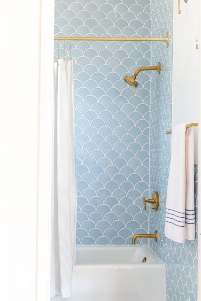
[via]
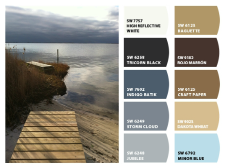
2. SURF + TURF: You can find my FULL post HERE on this peaceful color trend. It pairs seaside blues with the organic, natural tones of the coastal landscape for a palette that is earthy, happy & easy to live with.
[via]
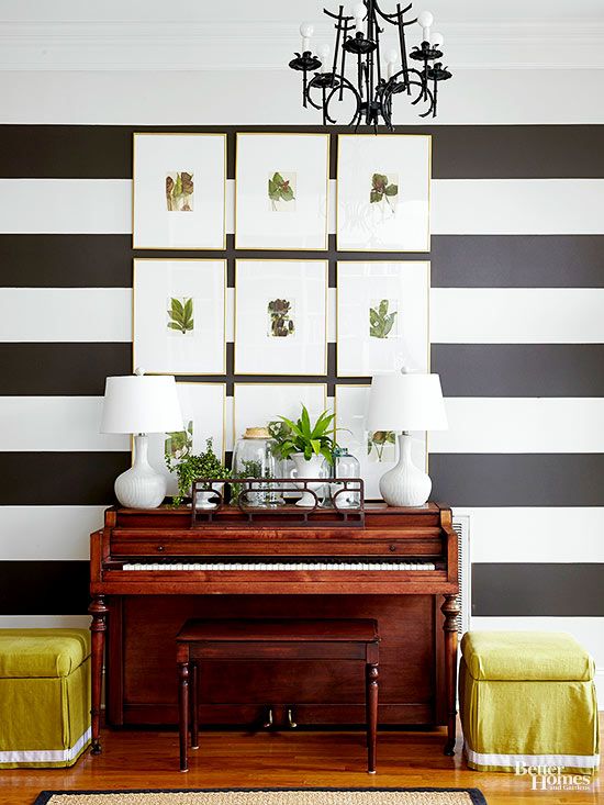
3. BOTANICALS: This has also been a trend we have seen and it will still be front & center in 2016. I do love botanicals, they can be introduced into your home in a variety of ways, you can go with a strong commitment or a light one and it works with so many styles from rustic to modern to traditional and all of those styles in between.
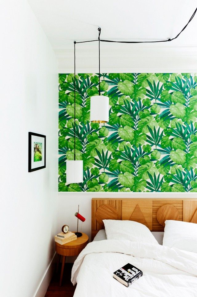
[via]
[via]
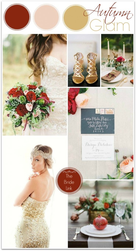
4. SAFRON: This is a new color trend in home décor, so new that it was tough to find an image but none the less you can see how beautiful the tone it. Safron is one of those hues that can go bold or earthy depending on how you use it.

[via]
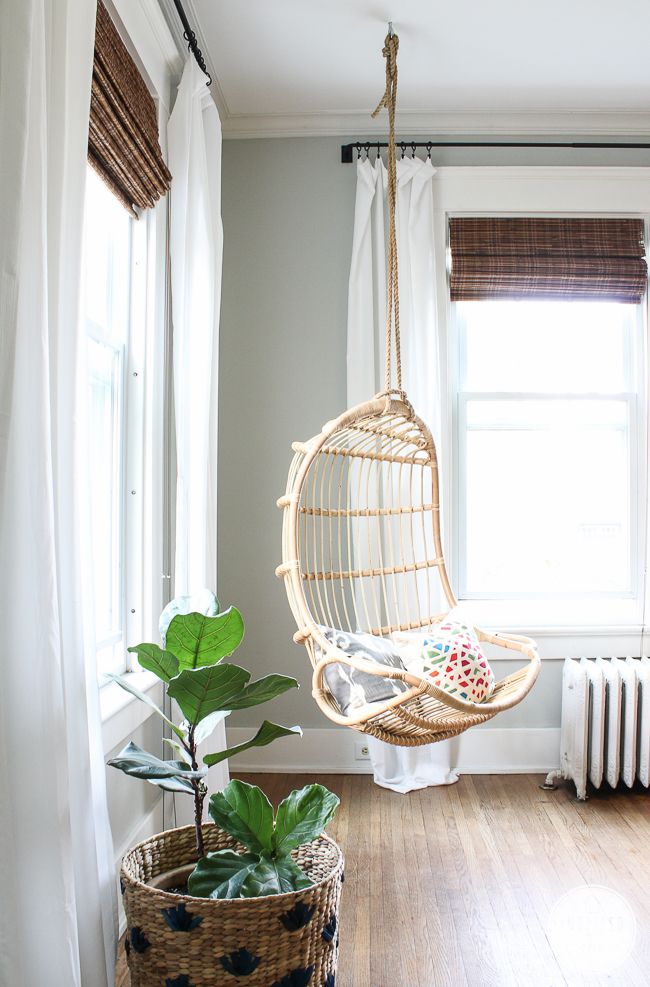
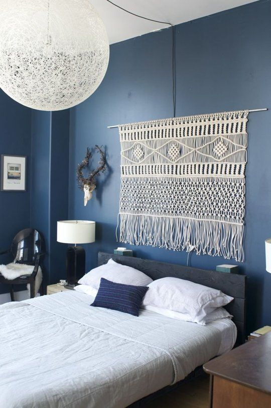
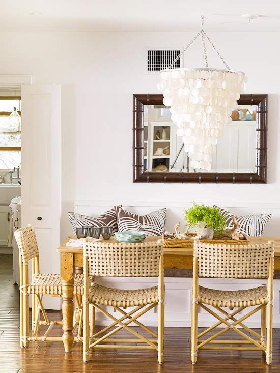
5. THE 70’S INFLUENCE: I know what you are thinking, harvest yellow, avocado green and those not so pleasing bold prints. Well the 70’s just got cool again with the revival of such things as macramé, rattan and the hanging chair. You can read more about it HERE over at Better Homes & Gardens.
[via]
[via]
6. INDIGO: YES, Indigo is still an “in” color but even if it wasn’t I would still love it. We have seen blue come and go through the years, my first dishware set in my early twenties was a navy and white speckled print, that would actually be pretty cool right now, see that is why you should never give or throw anything away, lol.
[via]
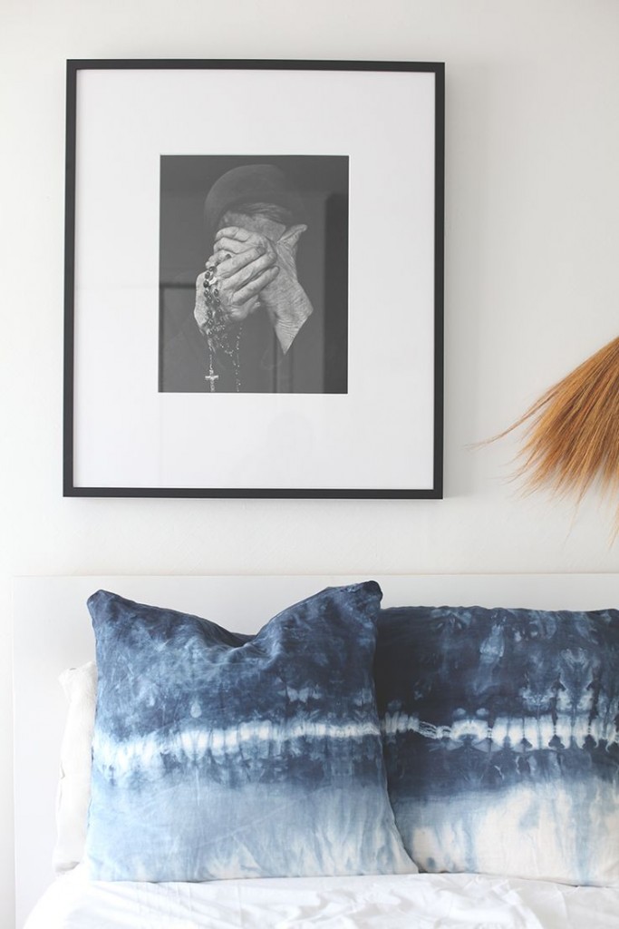
[via]
7. RICH DEEP BROWNS: Another color story that was popular in my 20’s but seemed to have been replaced with gray. For me, there is no substitute for the warmth browns can give to a space.
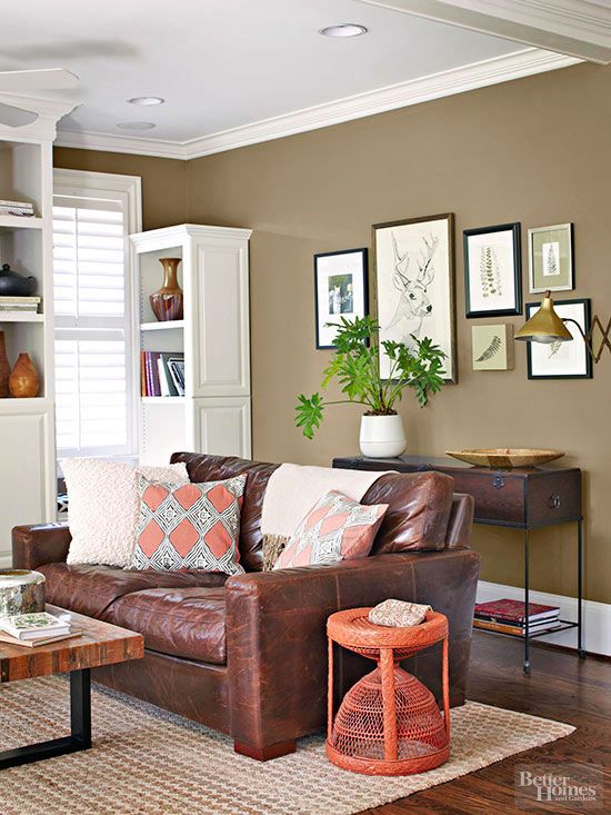
[via]
8. CAMEL: Here is another color that was so popular a decade ago but seemed to have lost steam. I feel like camel has made its way back though through the years in the caramel & cognac tones in leather, natural textures and woods. In my opinion every room needs this tone at least 3 times.
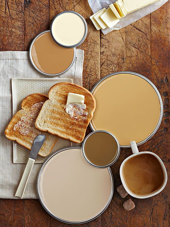
[via]
[via]
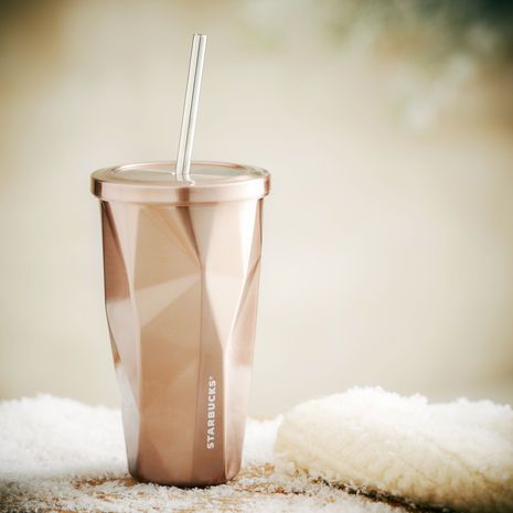
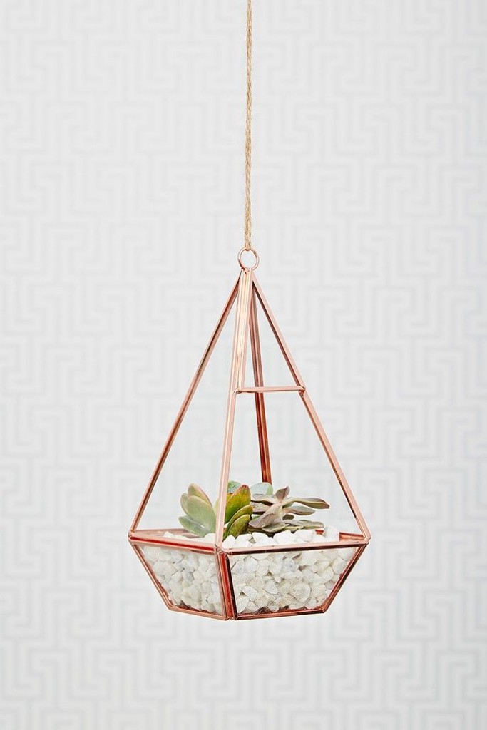
9. ROSE GOLD: Often we see trends hit fashion first, so you may have seen rose gold before but now it has hit the home front. This is a good example, at least for me where a few accessories will go a long way in filling to desire to jump on a trend.
[via]
[via]
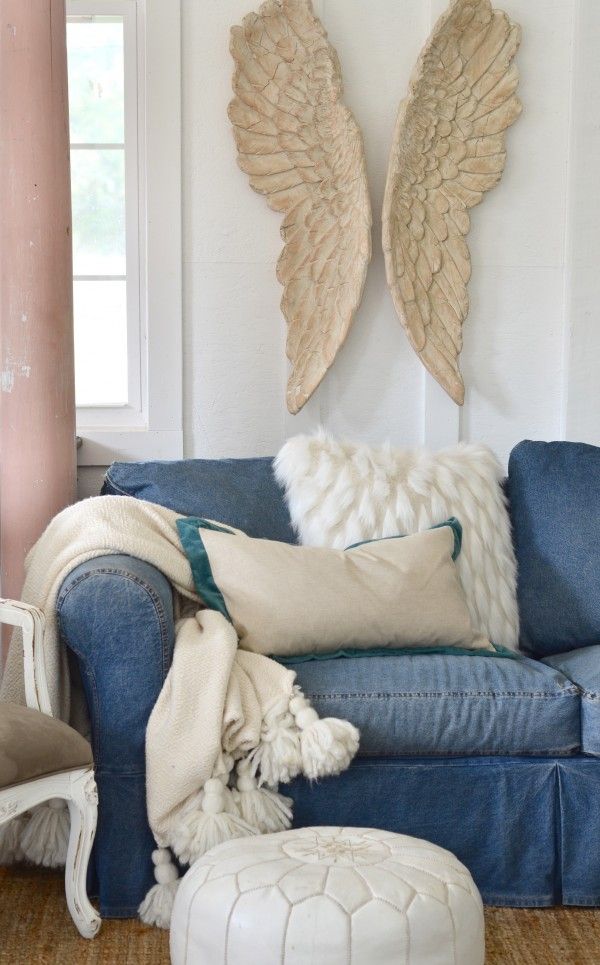
10. DENIM: Do I dare say it, another trend from my 20’s but this time denim is back with some experience, some years under its belt, meaning you will see denim have an aged patina, a worn look, like it has been around for a while. Which means…that denim chair I had would be looking real good right about now.
[via]
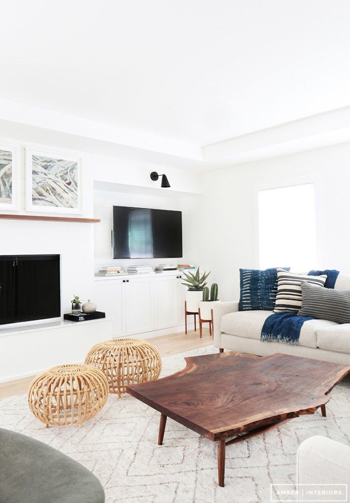
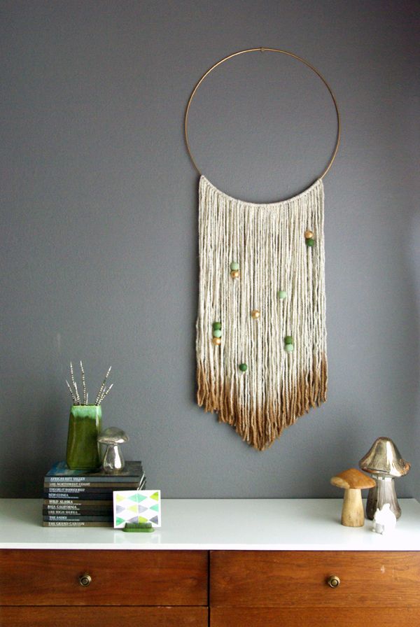
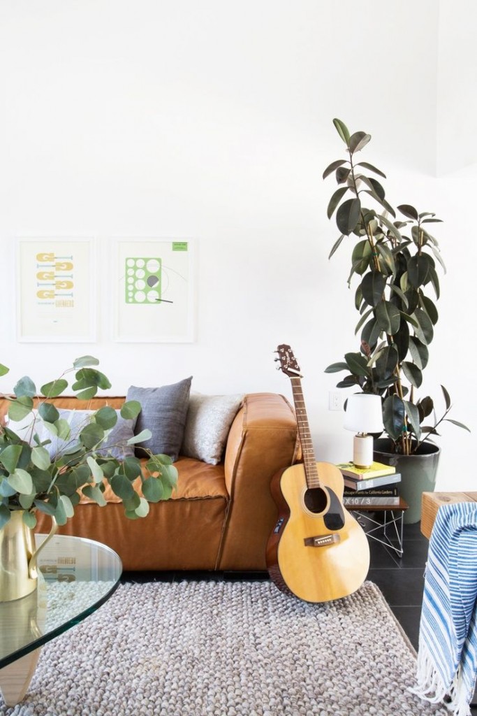
11. NATURAL + WOVEN TEXTURES: This is a trend that has been here and is not going anywhere in the near future. You can you use the camel trend with these textures, meaning these textures can bring in that warm color tone.
[via]
12. MERLOT + INDIGO: Another color story so new I couldn’t find a good example in home décor. My favorite color combo for winter {& fall} and one I have been wearing a lot. You can easily translate this palette into your home especially if you are loving and already using indigo, just add a few pops of merlot and you have the look. A beautiful kilim or oriental rug is a great start and pairs well with these hues as well.
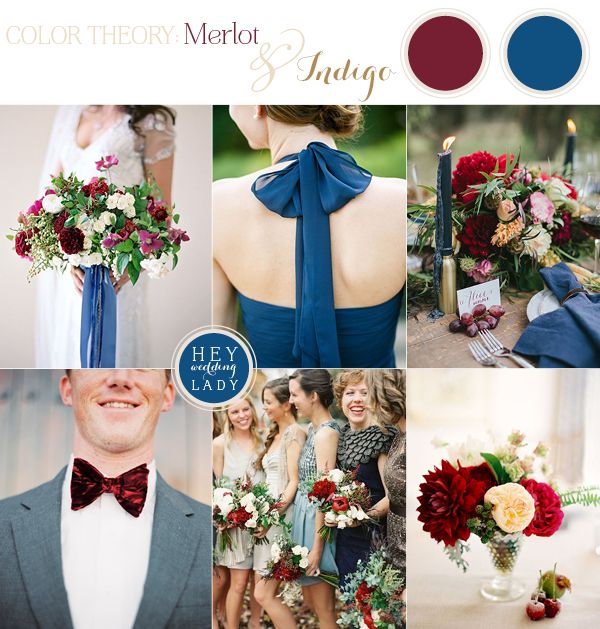
[via]
13. PINK + BLUSH TONES: Blush is another favorite for me, it works with every color tone and adds a soft layer to any space. I know pinks can seem more feminine but if you use them in a quiet way by pairing them with more masculine tones then a good, healthy balance can be found.
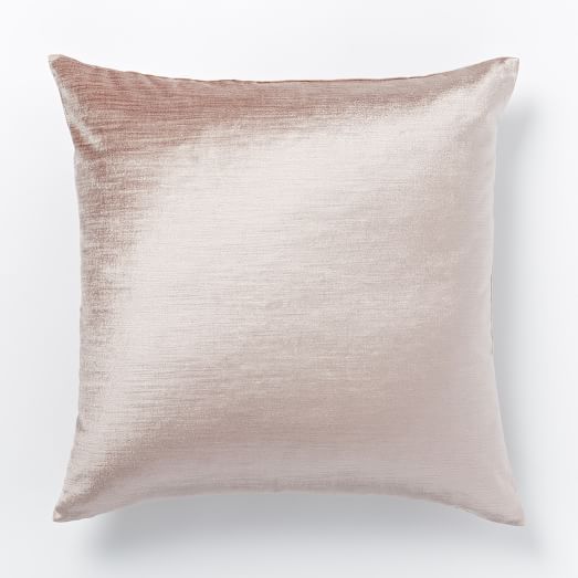
[via]
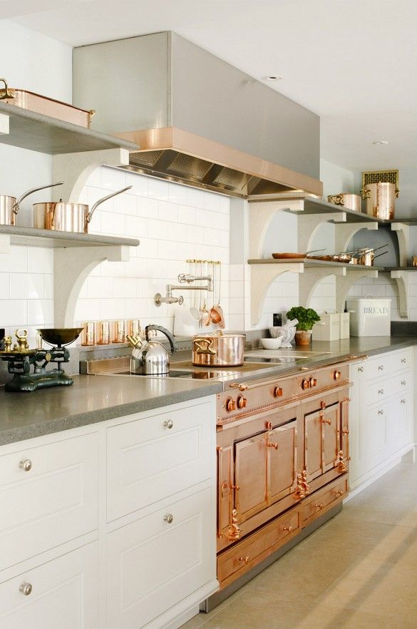
14. COPPER: You have seen it, probably been using it, well it’s staying, yay!!! Copper brings such a warmth to any space, I especially love it in a kitchen or bathroom. Don’t be afraid to jump in with this trend, it’s a timeless trend so if you love it, go for it.
[via]
15. BLOOD RED + CHAMPAGNE: This color palette is swoon worthy & makes me want to get married all over again. These tones would be beautiful in an interior space, I am thinking a neutral base with pops of red, burgundy, pink, champagne and lots of yummy, cozy textures.
[via]
In cased you missed my SURF + TURF article you can find it HERE.
Thank you for stopping by today, have a beautiful weekend.
hey girl love your post!
Thank you Shawnna!
Fishscales and blush are probably my favorite of the bunch here. I don’t see fishscales or scallops too often, but I’d love to see it used more!
Yes, I agree, those are 2 really good ones for this year! Stay warm:), Jen
I’ll always think those hanging “70’s” chairs are cool no matter what decade it is 🙂
So true Chris! Happy weekend! Jen
Love the post. Copper in the kitchen is where it’s at!
Love it all, especially the surf and turf. We just bought a beach home, and I was so inspired! Thank you!
Do you list places I can buy items I like?
yes! camel! feeling very validated right now.